Problem Statement
Consumers who are frequently engaged in grocery shopping lack an efficient method to find the best deals at grocery stores at their nearest location and a straightforward way to compare prices for specific products among various competitors.
Research
To understand our target demographic and the state of grocery shopping in 2023, we conducted a combination of qualitative and quantitative research.
• User interviews: We visited campus dormitories to interview students, gaining insights into the challenges they face when comparing grocery prices.
• Market & Industry Research: We analyzed data from two reputable research sources to examine U.S. grocery shopping trends. Our focus was on the rise of online grocery shopping among Gen Z, the increasing cost of specific grocery items, and the shifts in consumer behavior driven by price changes and digital convenience.

Persona: Aiden Carter
Age: 42
Occupation: Small Business Owner
Background: Aiden is a passionate entrepreneur who runs a boutique coffee shop in a trendy neighborhood. He values quality and uniqueness in the products he offers to his customers. Aiden is known for his attention to detail and personalized approach to customer service.
Goals:
• Aiden values a personalized experience that helps him discover unique and rare products that align with the distinct offerings of his coffee shop.
• He prefers a secure and streamlined payment process, as he often needs to make quick and bulk purchases.
Motivation:
Aiden's motivation stems from his desire to offer a unique and exceptional experience to his customers. He takes pride in curating a selection of high-quality and distinctive.
User Scenario
Aiden, the owner of a coffee shop, is gearing up for a special event to showcase his latest coffee blends. However, he's finding it challenging to compare prices and specifications of specialty coffee beans from various local places. The process of toggling between different websites and manually juggling details is both time-consuming and stressful, and this could potentially affect the success of his event.
Design Approach
Our design approach focuses on creating an intuitive and visually appealing experience tailored to millennials struggling to find local grocery deals.
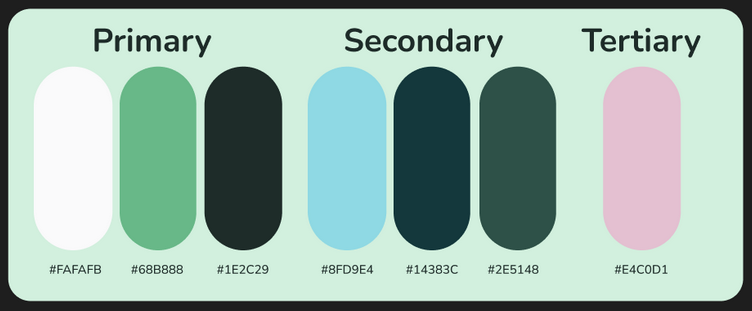
Color Palette & Psychology
We carefully selected colors that align with both our problem statement and our target audience’s psychology:
Green – Symbolizes vitality, freshness, and groceries.
Blue – Represents cost-effectiveness and financial trust.
Soft Pink – A subtle accent to add vibrancy while maintaining balance.
Green – Symbolizes vitality, freshness, and groceries.
Blue – Represents cost-effectiveness and financial trust.
Soft Pink – A subtle accent to add vibrancy while maintaining balance.
To ensure a harmonious and user-friendly UI, we followed the 60-30-10 rule, a well-known design principle:
60% – Dominant color (Green)
30% – Secondary color (Blue)
10% – Accent color (Soft Pink)
We utilized a split complementary color scheme, pairing the main color with colors analogous to its complementary hue.
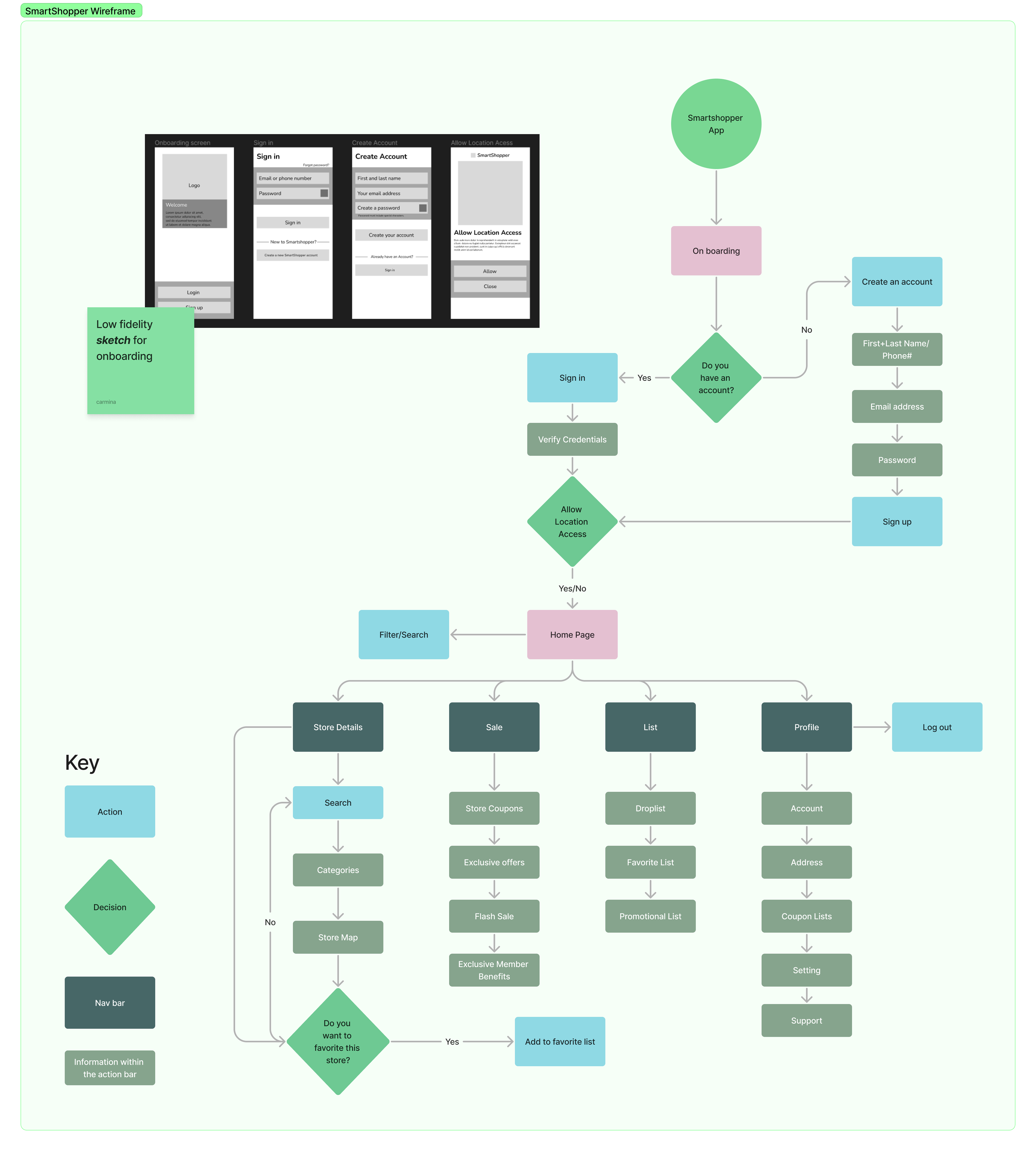
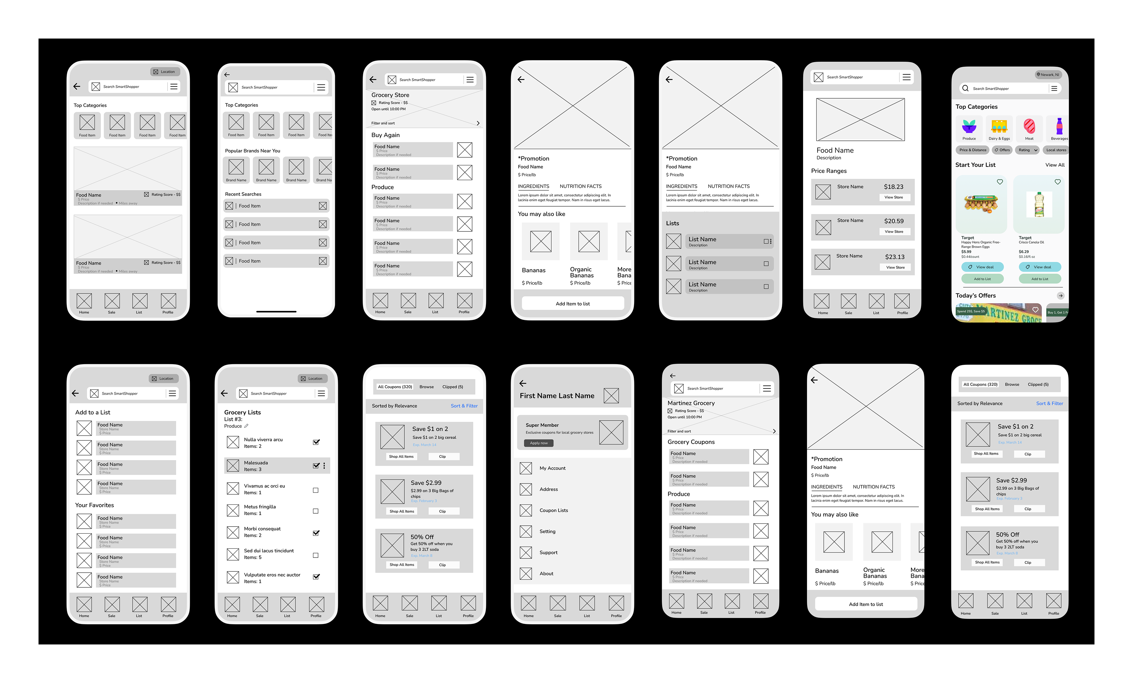
Sitemap and Wireframes
User Testing
During our user testing sessions, participants were tasked with completing three key actions within the application.
Task 1: Finding & Comparing Prices
Users were instructed to open the app, search for “Brown Eggs,” and compare prices across different grocery stores. This tested the app’s search functionality, ease of navigation, and clarity in price comparison.
Task 2: Filtering & Sorting Results
Participants were asked to filter and sort their search results to focus on essential grocery items. This assessed how effectively users could refine their selections and whether the filtering options were intuitive.
Task 3: Saving Limited-Time Promotions
Users had to locate a limited-time grocery promotion and save the coupon to their list for future use. This evaluated the app’s ability to highlight deals and ensure a seamless coupon-saving experience.
Revisions & Refinements
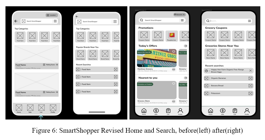
Wireframe Adjustments for Better Problem Alignment
Before proceeding with user testing, we identified a misalignment between our wire frames and the core problem statement. We didn't want users testing a product that didn't specifically address the issue we aimed to solve. As a result, we revisited our wire frames to ensure they were better align with our project's goals before moving forward.
Key Revisions
Home & Search/Filter Pages
• Improved scrolling functionality by enabling both horizontal and vertical scrolling to prevent content cutoff.
• Enhanced Home Page Experience: Featured clipped coupons and today's offers prominently at the top, sorted by the chosen location (e.g., Newark, NJ).
• Refined Search & Filter Functionality: Organized by coupons and nearest locations, making navigation more intuitive.
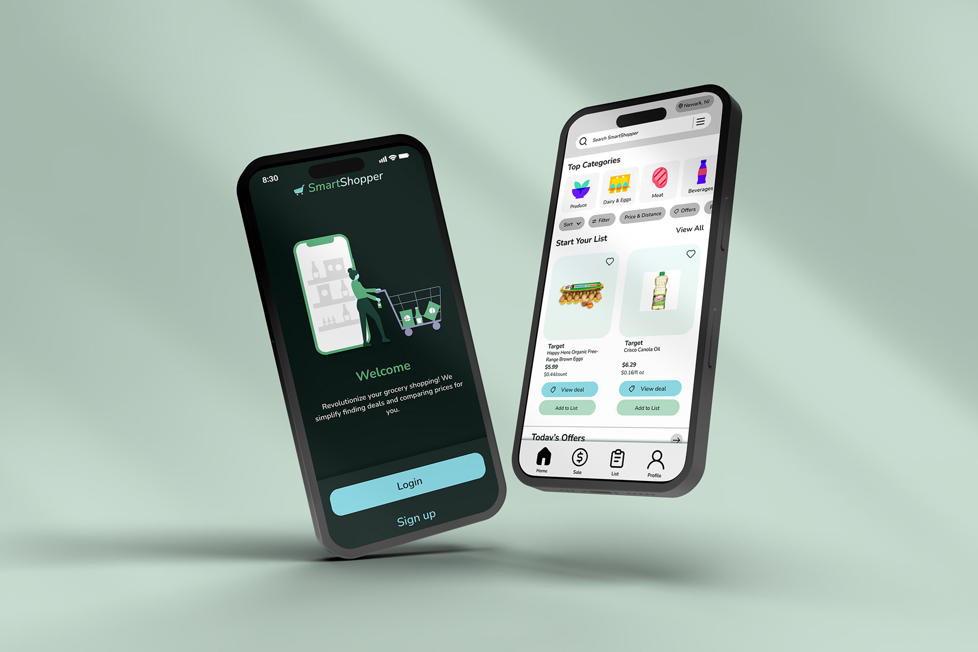
Sample Images of Final Prototype

The demonstrated functionalities are designed around key task scenarios, including finding and comparing prices, filtering and sorting results, and identifying limited-time promotions to enhance the user’s shopping experience.
Reflection
Throughout this project, I encountered several challenges. One of the most prominent was the lack of effective communication and collaboration within my group. Not everyone was equally engaged, which made coordination difficult. However, I learned to adapt and focus on what I could control to ensure the project’s completion.
Learning how to use Figma for prototyping was another challenge, as it was my first time working with the tool. Understanding wireframing, creating animations, and translating ideas into an interactive prototype required a lot of self-teaching. Despite the initial difficulty, I realized that taking the initiative to learn new tools is essential in UX design.
This experience taught me the importance of adaptability—both in working with a team and in learning new software. I also came to understand that not everyone in a group will have the same level of interest or commitment, as people have different priorities.